Feel free to use this image for your own blog or website, just be sure to link back, thank you!
Pages
▼
Wednesday, October 31, 2012
New Spaceship Model
Feel free to use this image for your own blog or website, just be sure to link back, thank you!
Saturday, October 27, 2012
An Attempt at Concept Art
Friday, October 26, 2012
New Model For Sale -- Near Future Spaceship
Here's my most recent model, a spaceship that I imagine could be built in
the next 10-20 years or so, for perhaps a mission to Mars or something:
Here's a link to it for sale, also more pictures of it: -Link-
Thursday, October 18, 2012
Alien
I used subsurface scattering on the head, much of the body is UV unwrapped and textured, but not all of it.
Thanks for visiting!
Feel free to use these images for your own blog or website, just be sure to link back, thanks!
Tip: Getting Raw Stock Photography
Photo textures are a great way to add realism and interest to a 3D work, there are many places online to get free textures or stock photography, but sometimes the best way to get texture pictures is to take them yourself. Taking the image yourself also gives you legal rights over the image, just make sure it isn't a picture of a sculpture or some other copyrighted work such as a drawing or printed pattern or such.
It might be a good idea to build up a library of textures and images for you to use so that you don't have to go take pictures every time you want to use some textures, take a look around your own property and snap pictures of anything that might be of use, rusty pipes, concrete, grass, wood [just make sure it isn't a printed pattern], dirt or anything else that could be used for 3D work.
You can use macro mode [the tulip icon usually] to take close up shots:
Thanks for reading!
Feel free to use these images for your own blog or website, just be sure to link back, thanks!
It might be a good idea to build up a library of textures and images for you to use so that you don't have to go take pictures every time you want to use some textures, take a look around your own property and snap pictures of anything that might be of use, rusty pipes, concrete, grass, wood [just make sure it isn't a printed pattern], dirt or anything else that could be used for 3D work.

You can use macro mode [the tulip icon usually] to take close up shots:
Thanks for reading!
Feel free to use these images for your own blog or website, just be sure to link back, thanks!
Wednesday, October 17, 2012
Tutorial: Planet Rings
Here is a simple technique to make planet rings, done in Blender 2.64:
This tutorial will assume you already have at least some basic knowledge to how Blender works and that you know how to use the interface and such.
1.
First start a new scene, then add a plane (Add>Mesh>Plane).
2.
Now go into the material settings and click the "New" button.
3.
Now set the specular to 0, turn transparency one, and set alpha to 0 (right image).
4.
Now go into the texture settings (one button to the right of the material settings) and click "New", much like you did on the material settings.
5.
Next set the type to "Blend", progression to "Spherical" and under the "Influence" settings, turn on "Alpha".
6.
Now in the "Colors" section (in the texture settings as well), turn on "Ramp", click the "Add" button to add a new point to the gradient and using the button circled in blue, set the color to black and the alpha to 0 on this new point, then slide the points around using the bar (not circled) to match the image to the right.
7.
Now you can add your planet to the middle of the plane, if your planet doesn't have a material add one.
Then go into the material settings, and turn on "Receive Transparent" under the "Shadow" panel.
This is so that the transparent areas of the plane do not cast shadow over your planet, just the ring.
Also do this to anything that is going to be in the planes shadow.
So far your rings might look something like this:
8.
What you'll want to do next is go back to the "Colors" section of the texture settings (If the settings don't show the first time you click them, click the material settings, then the texture settings) of your plane (ring) and add some points, adjusting the colors, alpha and positions as you've done before in step 6 until you get something you like:
Thanks for reading!
Tuesday, October 16, 2012
Skyboat
Here's my most recent model, it's meant to be a floating boat, with the gas chambers inside the hull and the wings and such meant more for control than lift.
Feel free to comment or critique!
Thanks for looking.
Feel free to use these images for your own blog or website, just be sure to link back, thanks!
Friday, October 12, 2012
Tip: Using Contrasting or "Clashing" Colors
A contrasting color can be used to draw attention to a particular part of an image it can be used to make a subject stand out against a background where it would otherwise blend in.
A contrasting color is a color on the opposite side of the color wheel, a color does not have to be on the exact opposing side of the color wheel to be considered contrasting.
Here are a few examples of contrasting colors:
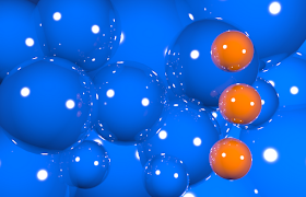 When you have an image where a subject seems to blend into the background, it may be good to use contrasting colors to make your subject stand out more.
If coloring the subject in the contrasting color of the background is not feasible, you may want to try using lighting to provide contrast, for example, if your scene is a blue winter scene, consider using the warm orange glow of candlelight to provide a contrasting color light over your subject.
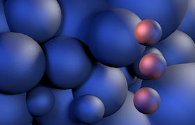 Here is an example of lighting being used to provide contrast, all the the spheres are a grey color and orange lights are being used to provide contrast to a subject that would ordinarily blend in.
I hope this post helps you in your future art projects, thank you for reading!
Images in this post may be used on your own blog or website as long as you link back, thanks!
Thursday, October 11, 2012
Metal Monster
Here's my newest project, a metal monster, I suppose it's half octopus, half spider or something like that.
It's part Blender and part Gimp, the smoke and slight glare being done in Gimp.
If you want to use the image for your own blog or website, go ahead, just be sure to link back here, thanks!
It's part Blender and part Gimp, the smoke and slight glare being done in Gimp.
If you want to use the image for your own blog or website, go ahead, just be sure to link back here, thanks!
New Item In My Shop Today!
Added something new to my TurboSquid shop today, a sci-fi device of sorts.
It isn't much, but at least it's cheap:
Here's a link to the page, with more renders and some wireframe renders:
http://www.turbosquid.com/3d-models/3d-model-device-parts/699546
It isn't much, but at least it's cheap:
Here's a link to the page, with more renders and some wireframe renders:
http://www.turbosquid.com/3d-models/3d-model-device-parts/699546
Wednesday, October 10, 2012
Want to use my pictures?
In case anyone wants to use any of my previously posted images for their own blog or website, go ahead, just be sure to link back to me, of course, if you want to use any of it for your wallpaper, go right ahead.
Monday, October 8, 2012
Old Airplane
Did some more looking through my pictures, here's an airplane model I did awhile ago:
Some renderings of it are included with a game making program called "Game Develop", along with some of my other graphics, (not all the graphics that come with Game Develop were made by me though).
Some renderings of it are included with a game making program called "Game Develop", along with some of my other graphics, (not all the graphics that come with Game Develop were made by me though).
Dinosaurs
Here is a few dinosaurs I made for a contest once, none of them got a spot, but I'm still happy with some of them anyways.
Saturday, October 6, 2012
Tip: How to Use Depth of Field.
Depth of Field[DOF] can be a very useful tool for adding realism and defining scale of digital scenes, but it is often used improperly, sometimes giving scenes a bad sense of scale, hopefully this post can teach you how to properly use DOF on both large and small scenes.
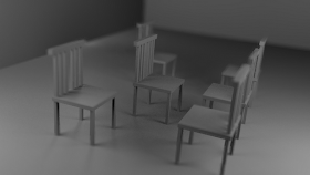 In this computer render, DOF is used improperly, the chairs look miniature, as though they were dollhouse furniture.
The DOF makes the scene go from blurry to clear to blurry again as you get further from the camera, however the clear point is several feet from the lens, try to avoid this.
In general it might be best to avoid staying away from DOF in large scenes, however there are instances where you can use DOF correctly in large scenes.
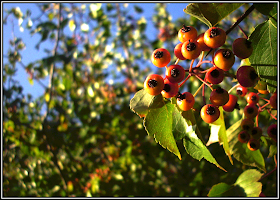
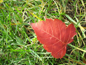
In this photograph, you can tell that the leaves in the background are quite a distance away from the subject in the foreground, the scene does not appear as though it could fit in a dollhouse. The focus is very near to the camera, and the amount of focus on objects far from the camera does not change very much with distance.
You can also do the reverse of the above image, where objects close to the camera are blurry, and objects further out are clear.
I hope this post helps you achieve better results with your renders, feel free to leave comments or suggestions!
Thanks for reading!
 In this computer render, DOF is used improperly, the chairs look miniature, as though they were dollhouse furniture.
The DOF makes the scene go from blurry to clear to blurry again as you get further from the camera, however the clear point is several feet from the lens, try to avoid this.
In general it might be best to avoid staying away from DOF in large scenes, however there are instances where you can use DOF correctly in large scenes.

In this photograph, you can tell that the leaves in the background are quite a distance away from the subject in the foreground, the scene does not appear as though it could fit in a dollhouse. The focus is very near to the camera, and the amount of focus on objects far from the camera does not change very much with distance.
You can also do the reverse of the above image, where objects close to the camera are blurry, and objects further out are clear.
I hope this post helps you achieve better results with your renders, feel free to leave comments or suggestions!
Thanks for reading!
Friday, October 5, 2012
Vector Art
You might suppose by my username 'MillionthVector' that I mainly do vector art, actually I mainly do 3D art, MillionthVector coming from the fact that 3D points are stored in vectors (a vector being a variable with multiple numbers as far as I know), anyways, I can actually do vector drawings though, I'm just not very experienced with it at the moment. I use Inkscape for vector graphics.
Here's a tiger I made awhile ago that's just sitting on my hard drive:
Here's a tiger I made awhile ago that's just sitting on my hard drive:
Abstract
Here's another piece pulled from "My Pictures", this one actually won a contest, well in a way, 3rd place I guess (not sure though, the contest was kind of vague about that), I won the 'abstract' category although there wasn't any categories when the contest began. O_o?
Anyways I'm glad it got something.
Here's something else I entered in that competition as well:
Anyways I'm glad it got something.
Here's something else I entered in that competition as well:
It didn't get anything, something else won the photo realism category, hmmm, maybe because it was rubbish? (Hee-hee.)
Photorealism?
Awhile ago I made some entries for a contest, the subject... photorealism.
Both of these images took loads of time to create, exactly how much I don't remember, at least I week for each image I believe. Sadly the rules of the contest only permitted one entry, I chose to submit the wooded scene as I had concerns of the realism of the reef scene.
It didn't place anywhere, not even special mention. Oh well, maybe someday... :)
CG Planet Scenes
Hello, welcome to my blog, this blog is going to be mainly about 3D art, as well as the possibility of some 2D art pieces. My main tools are Blender3D and Gimp, I have had several years of experience with using both of these tools.
Recently I have been working on some planet pictures, I've seen some amazing CG planet images, this is my attempt to do something like them. Blender has been used to make the planets, clouds, asteroids and also the ring and the spaceship is from Blender, the backgrounds were made with pictures of real clouds. Gimp was used to make stars and such.
Recently I have been working on some planet pictures, I've seen some amazing CG planet images, this is my attempt to do something like them. Blender has been used to make the planets, clouds, asteroids and also the ring and the spaceship is from Blender, the backgrounds were made with pictures of real clouds. Gimp was used to make stars and such.


